Unisys
2022-2024
Stealth Canvas
Redesigning the Canvas — the main screen of an enterprise security product — to fix what made it hard to read, hard to trust, and hard to use.
Overview
The screen where Zero Trust actually gets built
Stealth is built around an idea called Zero Trust, which works like this:
Nothing on the network is trusted automatically — not a server, not a user, not a device.
Every single connection between two things has to be explicitly allowed by an administrator.
If a connection isn't explicitly allowed, it simply can't happen.
The Canvas is the screen where an administrator sets all of this up. It shows everything as a map of dots and lines:
Each dot is a role, a group of users, or a security boundary called a "Configuration."
Each line is a connection that's been allowed between two of those dots.
Some connections are encrypted and secure. Others are not. Some are shared across multiple parts of the organization. Others are locked to just one part.
In other words, the Canvas isn't a chart you glance at — it's the actual control panel administrators use to build their organization's security setup, piece by piece.
By the time I joined this project, the Canvas had been around for years and had grown without much design attention. It looked fine with a handful of dots on screen. At real-world scale — hundreds of roles and connections — it broke down.

Myself
UI/UX Designer
The Impact
Instead of pitching a vague "let's redesign the canvas," I identified three specific problems, proved each one with evidence, and fixed them one at a time. Each fix stood on its own — with its own reasoning, its own before-and-after, and its own measurable improvement.
What changed, in short:
- Administrators can now tell what matters on screen, even with hundreds of items visible at once. - Administrators can tell whether a connection is secure just by looking at it no clicking required. - The same click, button, or menu now behaves the same way everywhere in the product.
Problem
What was actually broken
Problem 1 — You couldn't tell what mattered on screen
What was happening:
A single screen could show hundreds of roles and connections at once.
Every one of them — important or not — was rendered as the same grey dot connected by the same grey line.
There was no visual difference between a role with one connection and a role with fifty.
01
Why this was a real problem
"Think of a security guard's wall of monitors, each showing a different camera feed. If every screen displayed the exact same static image regardless of what was actually happening in front of that camera, the guard would have no way to tell which feed needs attention right now".
Administrators were dealing with a version of that same problem. Good layouts usually lean on a basic idea from visual perception — things that belong together should look like they belong together, so the eye can group them automatically instead of checking each one by hand. Here, everything looked the same regardless of whether it belonged together or not, so that grouping never happened. The interface left all the work of "figuring out what's important" to the person looking at it.

No clear distinction
Problem 2 — You couldn't tell if a connection was secure
What was happening:
Whether a connection was encrypted or not, shared across the organization or locked to one part of it, every connection line looked exactly the same: plain grey.
The only way to find out what a connection actually was, was to click on it and open a details panel.
02
Why this was a real problem
"Electricians color-code wires for one reason: so you know which one is live before you touch it. Take that color-coding away and every wire in the wall looks the same, safe or dangerous".
This is really a case of the interface not showing its own status — a fairly basic rule in interface design is that the system should always tell you what state something is in, without making you go dig for it. A security tool has one job above all else: showing you what's actually connected to what, and how safely. If you can't tell that without a click, the tool is quietly failing at the one thing it exists to do.
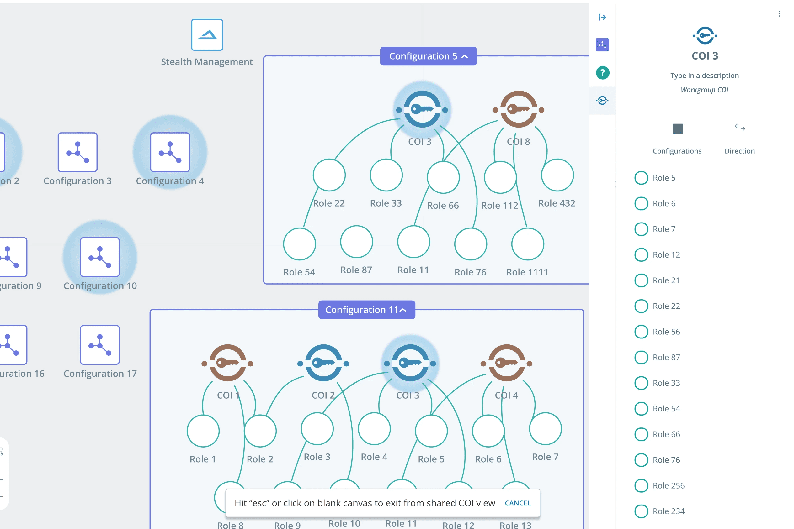
Connections not clear
Problem 3 — The interface didn't behave the same way twice
What was happening:
A menu button looked identical whether it was turned on or off.
Some controls didn't look clickable at all, so people weren't sure they were buttons.
The same kind of information (like a list of roles) was laid out differently depending on which screen you were looking at.
The product used internal terms (like "Member") that didn't match how administrators actually thought or spoke about their own work (they thought in terms of "profiles").
There were duplicate options on screen that looked different but did the same thing, with no explanation of why both existed.
03
Why this was a real problem
On their own, most of these look like small things. But people build trust in software the same way they build trust in a person: by seeing it behave the same way, twice. A button that doesn't quite look like a button is a small thing — it's also a broken promise, in miniature. Once administrators start second-guessing whether something is clickable, or what a label actually means, every action turns into a small negotiation instead of something they can do on autopilot.
Research
How I found these three problems
Before changing anything, I ran a structured review of the existing Canvas — sitting down with the interface the way a new administrator would, and checking it against well-established rules of thumb for good software design (the kind that cover things like: can people tell what's clickable? does the same action always look and behave the same way? can people tell the current status of something without extra steps?).
What that review turned up:
A long list of individual friction points — big and small.
Almost all of them traced back to one of the three root problems above, rather than being scattered, unrelated issues.
That's what let me build a focused case around three specific fixes, instead of proposing a vague, all-purpose "refresh."
I also looked at how other products that show networks of connected things — some other security tools, along with general diagramming and mapping tools — handle the same basic challenge: showing a lot of connected information without it turning into visual noise.
What that comparison showed:
The stronger examples never tried to show every single connection at full visual strength all at once.
They used focus and grouping — bringing forward what's selected, and fading everything else — which directly shaped the fix for Problem 1.

Ideation
Defining the pieces before redesigning anything
Before I touched any visual design, I had to nail down, in plain terms, exactly what every piece on the Canvas actually represented — what a "role" is, what a "configuration" is, what the different kinds of security groups mean, and what the different types of connections mean. Every fix to the three problems had to trace back to one of these plain-language definitions — not just look better on its own.
How the work was organized:
Fixing Problem 1 meant rethinking how the canvas shows focus and grouping at scale.
Fixing Problem 2 meant defining a consistent, at-a-glance way to show a connection's status.
Fixing Problem 3 meant rebuilding the details panel and menu into one predictable structure.
Specifications and mockups were shared with the engineering team as I went, rather than handed over all at once at the end — so navigation and interaction changes could be checked against real technical constraints early.
Testing interaction flows early
Before committing to high-fidelity designs, I used Claude and Figma Make to quickly prototype and stress-test interaction flows — particularly for the layers concept in image editing and the co
mbined system/custom field filter behavior, where the logic was harder to validate on paper alone. This let me check edge cases and get faster feedback in stakeholder discussions before investing time in polished UI.

Canvas Elements & Workflow ideation
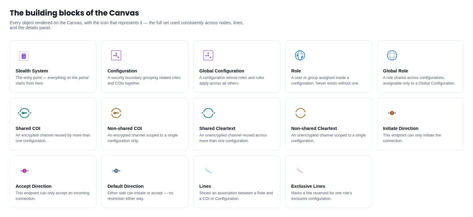
Canvas Icons
Designs
The same screen, before and after
Problem 1 - Making what matters stand out
When an administrator selects one role or group, its actual connections now visually come forward, and everything else fades into the background instead of competing for attention.
Related roles and groups are now grouped together under a clear label, instead of floating loose in one undifferentiated field.
Result: an administrator can pick out one group's real connections inside a screen with hundreds of items, instead of scanning the whole thing by eye every time.
Canvas Interface
Problem 2 — Making connection status visible without a click
Every type of connection now has its own distinct, consistent visual treatment, so status is visible directly on the line itself.
(The full color and icon system behind this fix is detailed in a separate companion case study — see "Explore more" below.)
Result: connection status is readable at a glance, with zero clicks required.
Problem 3 — Making the interface behave the same way twice
Rebuilt the details panel so it's laid out the same way every time, regardless of what you click on.
Gave the menu a clear, unmistakable on/off state, and added a working search bar to it.
Removed the duplicate, redundant options outright instead of trying to explain them better.
Rewrote confusing labels to match how administrators actually describe their own work.
Result: the same interaction pattern applies everywhere now — administrators only have to learn how the product works once, instead of relearning it screen by screen.
Comparison screen - 1. Old screen 2. Enhanced screen
Lessons
A strong case is built one problem at a time
What this project reinforced for me:
A redesign is easier to defend, and easier to scope, when it's broken into specific, provable problems — instead of pitched as one big "this needs work" ask that anyone can push back on with their own opinion.
In a tool like this, things like visual consistency and status visibility aren't nice-to-haves — they're functional requirements. If someone can't trust that a button behaves the same way twice, or can't tell a secure connection from an unsecured one without clicking, that's not a cosmetic issue. It's a trust issue.
That habit — naming a usability problem precisely, tying it to a real cost, and fixing it on its own terms — is the same approach I still bring to scoping any design work today.
What's next for this product (not yet designed):
A view showing system-level details, not just individual roles and groups.
The ability for administrators to manually rearrange items on the canvas.
Breadcrumb navigation for moving between nested groups.
A full plan for how the canvas should adapt to smaller screens.