Case study
2023
Stealth Icon
A companion case study documenting the icon redesign, semantic color model, and accessibility validation created for the Stealth Canvas — how icons were audited, redesigned, and turned into a reusable visual language.
Overview
Designing a visual language for Zero Trust
Stealth is an enterprise security product built around Zero Trust: connections aren't trusted automatically, and administrators explicitly define which entities can communicate. The Canvas is where that security model is constructed — Roles, Configurations, security relationships, filters, and communication paths, all represented as a live visual network.
As the number of entities and relationships on the Canvas grew, the interface became harder to read and harder to trust. This project addressed one specific part of that problem: giving every major Canvas object a recognizable visual identity, and making its state understandable without forcing an administrator to open a details panel to check.
What I designed
- Every color on the Canvas moved from failing contrast — some as low as 1.08:1 — to passing WCAG AA in both light and dark themes. - Replaced ad-hoc icon styling with one consistent rule across all 13 elements and three interaction states: color encodes relationship and scope, shape encodes identity. - Validated the system at real density — dozens of Roles and COIs on a single Healthcare configuration — without losing legibility.

The Stealth Canvas in context — a Healthcare configuration in Enterprise Manager, with the redesigned icon system in place.
Problem
The canvas had grown faster than its visual system
As Stealth's canvas added more object types — Configurations, Roles, COIs, Cleartext filters, direction states — the icon set hadn't kept pace.
01
The icons weren't doing their job
-Icon sizing and stroke weight were inconsistent across the set, with no shared rule for when a shape should be filled versus outlined. -When multiple icons sat together on a dense canvas, they read as clutter rather than a system.
02
The palette failed its own accessibility bar
Before touching a single icon, I ran an accessibility audit against the existing canvas colors. The bar was a 4.5:1 minimum contrast ratio. The existing palette failed it badly and inconsistently — several colors sat at 1.08:1 to 1.22:1 against white, with wide unpredictable swings between light and dark themes on the same color.

The existing icon inventory, audited before any redesign work began — annotated with what needed color, clarity, or both.
Requirements of Redesign
Every element needed a shape that read instantly at 12–24px on a busy canvas; every color needed to clear AA compliance in both light and dark themes before it was allowed to carry meaning at all; and the same visual language needed to hold up consistently across the Canvas, the legend, and the details panel.
Research
Start with meaning, not shape
Before decomposing the Canvas into its semantic parts, the research phase started with an audit — what was broken, whether the accessibility bar had a real standard behind it, how established products solve the same problem, and what engineering and documentation needed from the system.
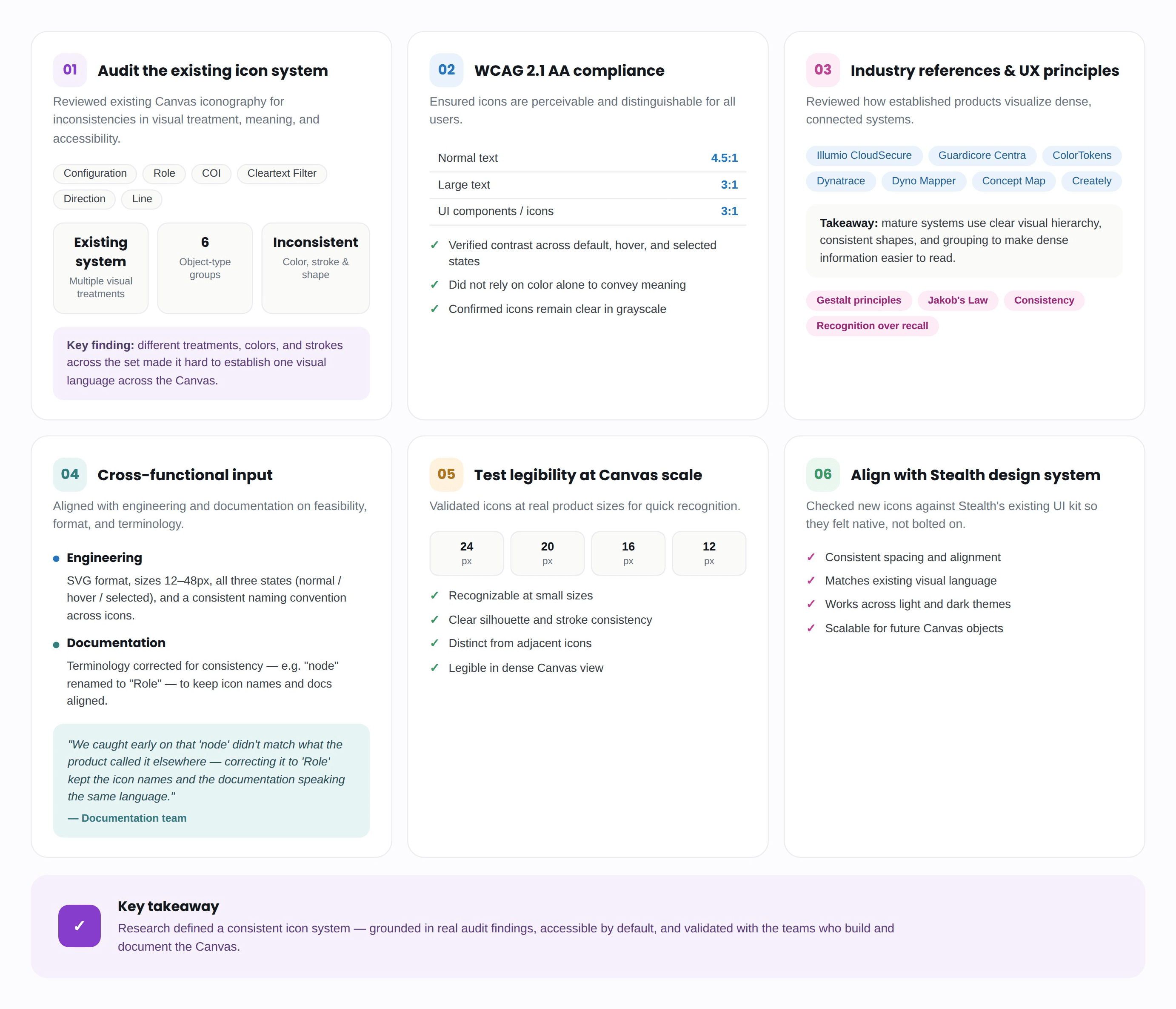
The research phase in full — audit findings validated against accessibility standards, industry practice, and both engineering and documentation teams.
Start with meaning, not shape
The work began by decomposing the Canvas into its smallest meaningful concepts before a single icon was sketched. Every object on the Canvas was mapped against the semantic dimensions it actually needed to carry:

Five independent dimensions every Canvas object could carry, mapped before a single shape was sketched.
One base object, controlled modifiers
Separating these dimensions mattered because a single Canvas object can carry more than one of them at once — a COI can be shared and encrypted and selected, all at the same time. Rather than inventing a unique icon for every combination, the system needed a base object plus controlled modifiers: object identity, state, and relationship treated as independent variables engineering could implement predictably.
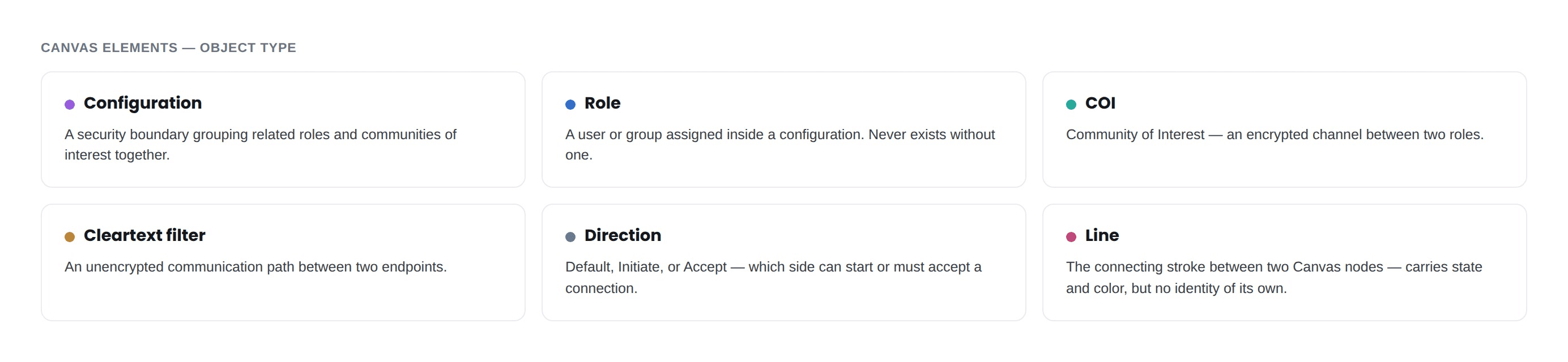
The six base object types the system needed to support, before states or color were layered on.
Ideation
From Concept to committed shape
With the semantic model in place, ideation worked through four variables that had to be solved independently — shape, direction, corner radius, and color — each tested before being locked.
Shape: finding a form language that scaled

Ideation for Configuration and Role — the shape families explored before each one converged.
Direction icons: from generic arrows to a paired notch
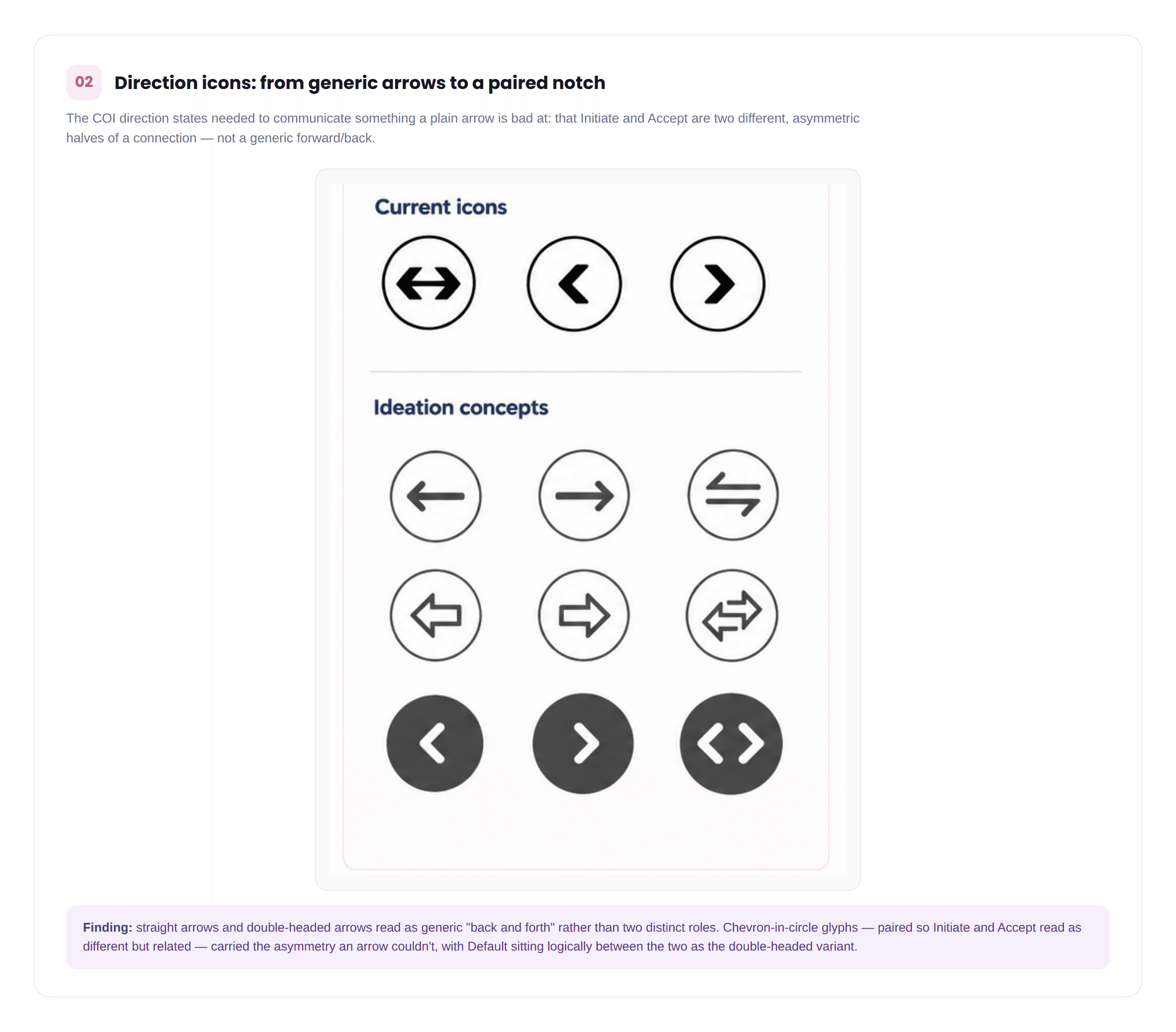
Direction icon concepts — straight and double-headed arrows tested before converging on paired chevrons-in-circle.
Corner radius: tested on the real COI icon
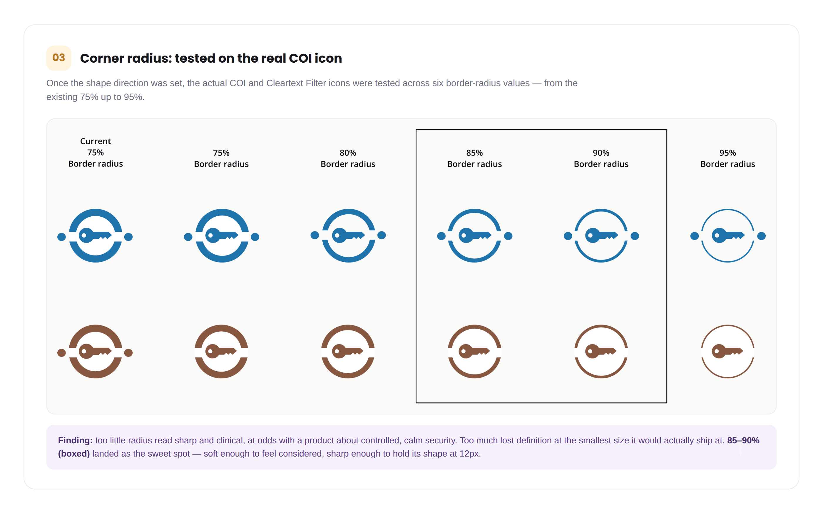
Six border-radius values tested side by side on the real icons — 85–90% (boxed) was the sweet spot.
Building and validating the color system
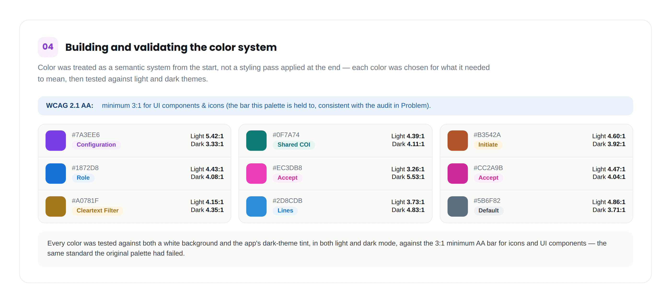
Every accent color validated at AA contrast in both light and dark mode, mapped to what it means across the Canvas.
Design
Building a flexible content system
Thirteen elements make up the finished Canvas language, grouped by what they do rather than listed alphabetically. Every icon carries a shape, a semantic color, and — for the ten node and channel icons — three documented states: Normal, Hover, Selected. Lines carry Normal and Hover only; Directions are three fixed, distinct icons rather than states of one. The rule holding all thirteen together: color encodes relationship and scope, never decoration.

The finished system — all 13 elements, their states, colors, and AA ratios, documented as a single reference sheet.
The same accent colors were chosen to hold up in both themes — each one validated at AA contrast against a light and a dark surface. Same 13 icons, same specs, only the background changes.
Every color in this system was built for two themes, not one. Verified AA contrast — light and dark.
The system at real density — dozens of Roles and COIs on one Healthcare configuration, still legible at a glance.
Future scope and lesson
Open Questions & Takeaways


What this taught me
The real shift in this project wasn't visual — it was treating color as a semantic system rather than a styling pass. Once "shared vs. non-shared," "structural vs. container," and "direction" each had their own reserved color family, the palette stopped being a set of nice colors and started being something a user could learn: see teal, know it's shared; see brown, know it's scoped. That's a much higher bar than "does this look good," and it's the one I'd apply first on any future design-system work.
The accessibility audit was the other lesson: doing it first, before any redesign work, turned "make it prettier" into "make it provably legible," and gave every subsequent color decision a pass/fail test instead of a subjective one.
Tokens aren't just values, they're decisions about how change moves through a system. The color meaning map in this project was the right instinct, but meaning without a token architecture behind it still leaves engineering exposed the moment the product needs a second theme.